Composing a dashboard
A dashboard answers “how are we doing, and what needs me” in that order: figures first, then how they move and divide, then what to act on. Compass’s sales dashboard is the worked example.
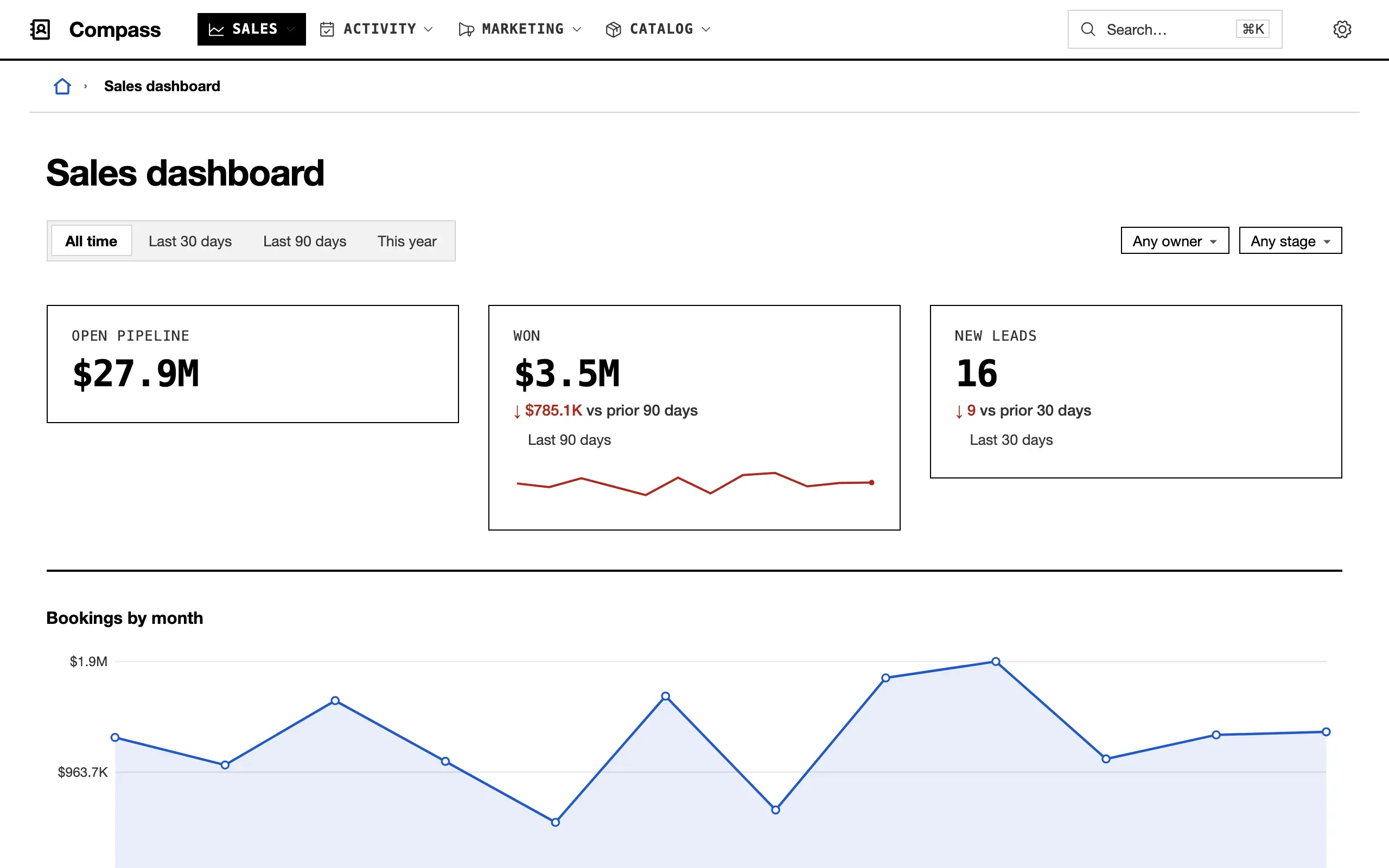
- Always, lead with a strip of three or four
metrics of equalwidth; a strip that does not divide leaves one card alone on a row — compass/dashboard.ts:4. - When a figure has a before,
compare: 'previous period'withbetter, andsparkfor its trend — dashboard.ts:13. - When the board is read by period,
windowson the dashboard andoveron each section they narrow — dashboard.ts:74. - When a figure moves over time, a
chartby month (by day only over a short window) — dashboard.ts:26. - When a total divides by a vocabulary, a
breakdownat half width, beside a donut of another division — dashboard.ts:30. - When two divisions cross, a
matrix— dashboard.ts:37. - When there is work waiting,
rowsof it with alimit, two to a row — dashboard.ts:47. - When a number needs a sentence, a
notelast — dashboard.ts:62.
The sections are in Dashboards.